System / Add-In Manager / Reports Central
Foundations / Background Data & Reports / Reports Central
Add a Chart to the Report
If you have selected to include numeric fields in the report, you can optionally present your data with an analysis chart. For example, you could add a pie chart that visually shows the distribution of floor area among the various departments.
Adding a chart is an optional step, as you can produce a report that presents just the table data you specify with your selection of fields, restrictions, and calculations chart to a report
Examine the sample reports available in the Reports tab for examples of analysis charts.
This topic has the following sections:
Numeric Fields
In order to add a chart to a report, the report must include a numeric field. See the discussion of numeric fields in the Calculate Data topic.
Chart Types
You can choose to add the following chart types:
| Chart Type | Description |
|---|---|
| Pie |
Presents data in a circular pie, with each wedge of the pie representing the percentage of the overall value (the field specified in Values)for the field on which you group the data (the field specified in Categories). The pie chart displays the percentage represented by each wedge; hover over a pie wedge to determine the value that the wedge represents. |
| Bar |
Presents data in a series of horizontal bars, with each bar proportionately representing the field on which you group the data. The bar displays the value for each category. The percentage of the overall value represented by the bar is not displayed. |
| Column |
Presents data in a series of vertical columns, with each column proportionately representing the field on which you group the data. The column displays the value for each category. The percentage of the overall value represented by the column is not displayed. |
| Line | Displays the calculation as a set of points connected by a single line. Line charts are handy for presenting information over a continuous period of time. For example, Total Lease Negotiable Area By Year can be presented in a line chart. |
Define a Simple Chart
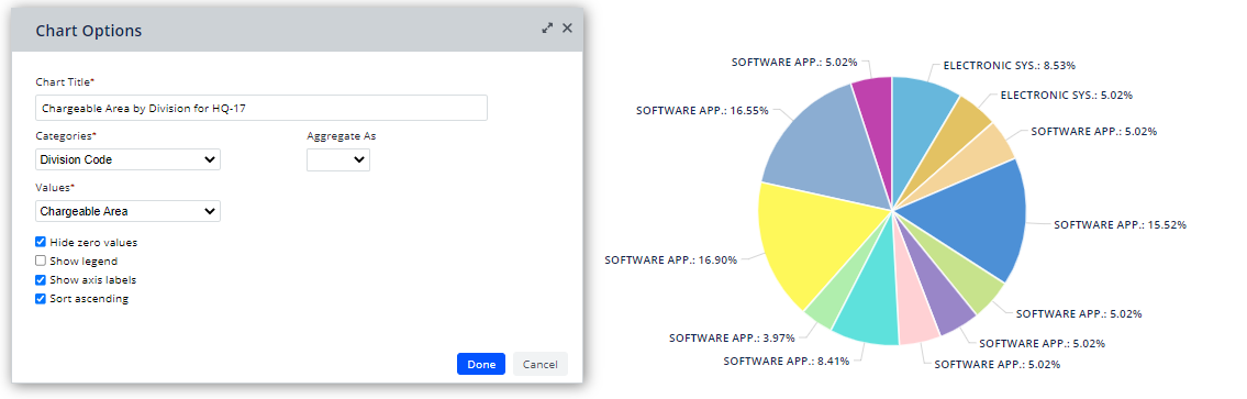
Without aggregating data, you can create useful charts that break down the values of a numeric field (the Values option) by a field you specify (the Categorizes option). For example, the below chart breaks down the Chargeable Area of the Rooms table by Division Code. The pie chart shows the percentage of overall chargeable area for each division. Hover over a pie wedge to see the value that the wedge represents.
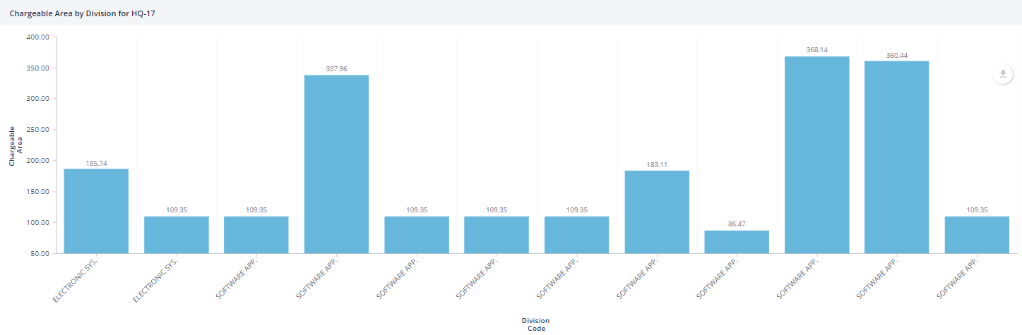
The same settings for a column chart generates this chart.
Procedure
-
Be sure that the fields you want to report on (such as Chargeable Area and Division Code in the below example) are active in the report. If not, return to the Select Fields tab to activate them.
-
You might want to set a filter; for example, in the above image the view is restricted to floor HQ-17. To remind the user of this restriction, the user has specified the restriction in the Chart Title. Note that he chart does not consider further filters that you make in the grid with the grid's Smart Search console.
-
From the Chart menu at the top of the vies, choose the type of chart: pie, bar, column, or line
-
In the resulting form, complete the options as follows:
Option Description Chart Title Although your report can have an overall title, you can explicitly describe what your chart reports on by completing the Chart Title option. Providing a clear description will help your users understand the chart. Categories Choose the field by which you want to break down the data. Aggregate As For a simple chart, such as the above example, leave this field blank.
This option groups Values (such as Cost to Replace) by the Categories field (such as Building). Note that COUNT can be used with any field in the Values list, as it is a count of records.
You can choose: SUM, COUNT, AVG, MIN, or MAX
Values If you are not aggregating data or if you choose any aggregation option except Count, you can choose only from a list of numeric fields active in the view.
If you chose Count for Aggregate As, you can choose any field in the view.
Hide Zero Values Hides zero values from the chart. This is helpful to produce a cleaner chart in cases where there are categories without data. For example, this option hides all buildings where the SUM of the cost to replace is zero. Show Legend This option is not selected be default since the Show Axis Labels option displays the same information. Show Axis Labels Typically, you will want to display axis labels so that the user understands what the columns or bars represent. The above column chart and pie chart display the axis labels. Sort Ascending Sorts in ascending order the Categories axis by the Categories value. For example, alphabetically sort from A to Z all buildings by Building Code in ascending order. -
Click done on the Chart Options form. The chart displays at the top of the report, under the filters.
-
If you want to further edit this chart, choose Chart Options from the Chart menu. You can edit any of the above options but you cannot change the type of chart.
Since you cannot delete a chart once you add it or change the type of chart, as you experiment with different report options, it is a good idea to save the report or save a copy before you add a chart. With this practice, you do not need to re-create the report (add table, fields, restrictions) if you want to change your chart.
Define a Chart with Aggregated Data
You might want to group data into categories and specify the aggregation function for the values (count, sum, average, min or max), so that report consumers receive summarized information. With a chart showing aggregated data, the Chart can present the summary, while the grid presents the details of the contributing records.
In the Chart Options form, set the Aggregate As option to SUM, COUNT, AVG, MIN, or MAX
Examples of Aggregated Data
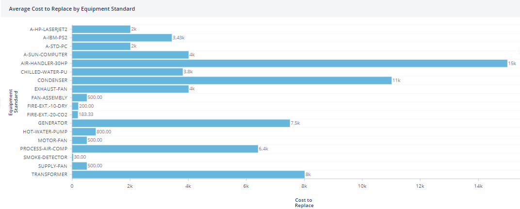
Define a column or bar chart summarizing the average cost to replace by equipment standard
Setting the report to these values produces the following chart. You can then review the grid records for the details of this summary information.
| Option | Value |
|---|---|
| Table | Equipment (eq) |
| Fields | eq_id, eq_std, cost_replace, bl_id |
| Filters | Cost to Replace > 0 Building Code = HQ |
| Chart Type | Column or Bar |
| Category | Equipment Standard (eq.eq_std) |
| Aggregate As | Average (AVG) |
| Value | Cost to Replace |
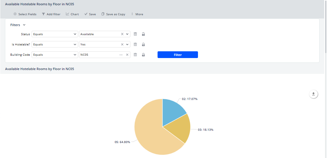
Define a pie chart counting the number of distinct rooms that are available and hotelable rooms by floor for building NC05
Setting the report to these values produces the following chart. You can then review the grid records for the details of the available rooms on floors 02, 03, and 05 in building NC05.
| Option | Value |
|---|---|
| Table | Room (rm) |
| Fields | Building Code, Floor Code, Room Code, Status, Hotelable?, Room Area |
| Filters | Building Code = NC05 Hotelable? =Yes Status=Available |
| Chart Type | Pie chart |
| Category | Floor Code |
| Aggregate As | COUNT |
| Value | Room Area |
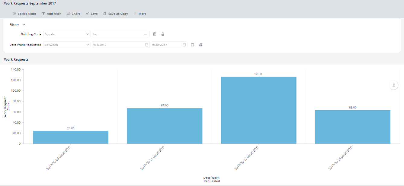
Define a line or column chart counting the work requests by date created for building HQ.
| Option | Value |
|---|---|
| Table | Work Requests (wr or wrhwr) |
| Fields | Work Request Code, Date Work Requested, Work Request Status, Building Code, Floor Code |
| Filters | Building Code = HQ Date Created: choose an interval |
| Chart Type | Line or Column Chart |
| Category | Date Work Requested |
| Aggregate As | COUNT |
| Value | Work Request Code |
Define a line or column chart showing the count of employees by badge date entering building NC05
Note: Since COUNT supports only numerical columns, you must aggregate by Auto-numbered ID. If the data is duplicated, this method does not ensure that Archibus counts distinct employees. However, since Badge Data is a proof of concept we work under the assumption that the sample data has only one record per day, per employee and building.
| Option | Value |
|---|---|
| Table | Daily Badge Swipes (bas_daily_badge_swipe) |
| Fields | Date Accessed, Building Code, Employee Code |
| Filters | Building Code = HQ; Date Created: choose an interval |
| Chart Type | Line or Column Chart |
| Category | Date Accessed |
| Aggregate As | COUNT |
| Value | Auto-Numbered ID |
Notes
Note: If any of the Primary Key or Foreign Key fields is not available in the Categories drop-down but instead appear in the Select Values drop-down, it is likely that the Numeric Format property for this field has been set to Default instead of No Separator. Ask a System Administrator to correct the Numeric Format for this field.
Note: It is possible to include in your chart fields that do not make sense to report on. Archibus does not prevent you from adding any field to your chart, including fields that do not add value
Next
Save you Report and Add a Title