Real Property / Strategic Financial Analysis / Financial Analysis
Explore the Financial Analysis Console
Once you have established the data for the unified cost model by calculating costs using the Aggregate and Forecast Costs actions, you can use the Financial Analysis Console features to get a top-down analysis of your enterprise's costs. The console can present pre-defined analyses, or your own personalized analyses. Analyses define the locations, assets, and analysis metrics that are shown when that analysis is selected.
Once the top-level analysis has found the specific building or asset that needs inspection, you can use the links to other applications to examine these outliers. See Furthering your Analysis Using Other Archibus Applications.
The Financial Analysis Console presents its data in three panels:
- the Capital and Expense Matrix
- the asset map
- the asset scorecard
Selections you make in one panel affect the data shown in the others, enabling you to flexibly examine data for specific assets and locations.
This topic describes the analyses you can make by filtering the map and selecting different types of analyses, maps, and scorecards.
Also see:
The Financial Analysis Console presents data in the:
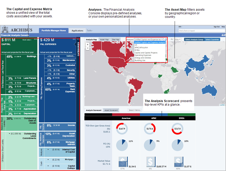
- Capital and Expense Matrix that shows total costs by cost category
- Asset, Analysis, or site maps that show locations and metrics for the analysis you select from the Analysis list.
- Asset or Analysis scorecards that show data for the cost categories you select in the Capital and Expense Matrix and for the selected analysis
The following image shows the Capital and Expense Matrix, and the Analysis Map and Analysis Scorecard for the Unified Capital and Expense analysis.
For more information on working with different maps, see Asset, Analysis, or Site Maps.
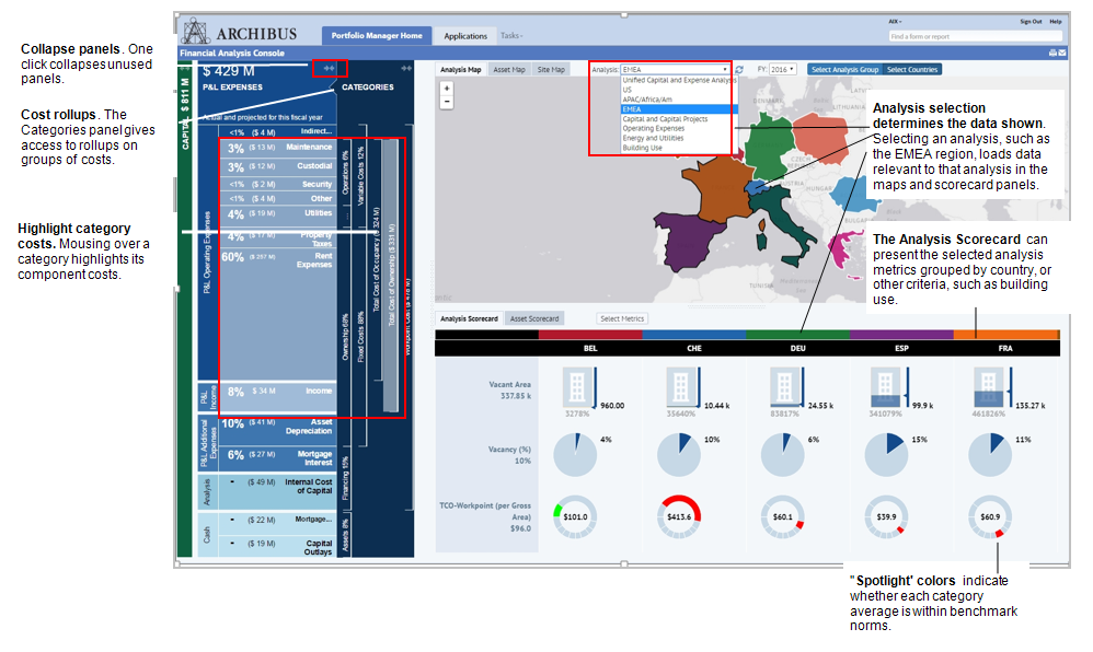
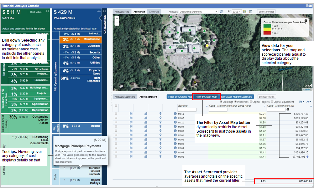
Use the Categories panel to select cost categories for which you want to review metrics. The following image shows the Categories panel and the Asset Map.
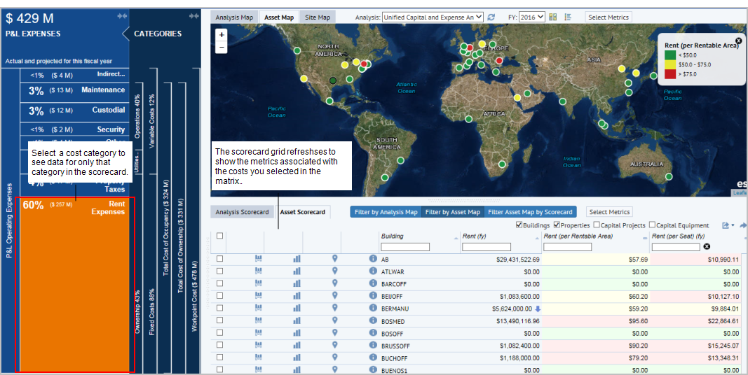
When you select a cost category from the Capital and Expense Matrix, the scorecard refreshes to show only metrics associated with that cost category. The cost category changes color to indicate that only its metrics are being shown in the scorecard. The following image shows the Asset Scorecard restricted by the Rent Expense cost category, but this restriction also applies to the Analysis Scorecard.
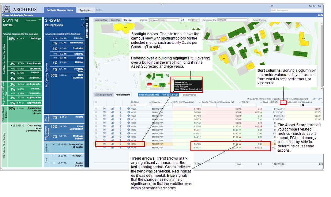
The Asset Map displays analysis metrics of your locations, while the Asset Scorecard gives the data view of the metrics with spotlight colors indicating the trend. In the gird, you can examine a metric's trending arrows. The below image shows some blue trending arrows, meaning that the change is neither good nor bad; the arrow notes the direction of change. This can be because a metric with "Report: Trend Direction" of "On Target is better" is on target. The metric may have increased or decreased, but is still between the "Low Warning" and the "High Warning" limits, so the change is neither good nor bad as long as the value is in the target range.
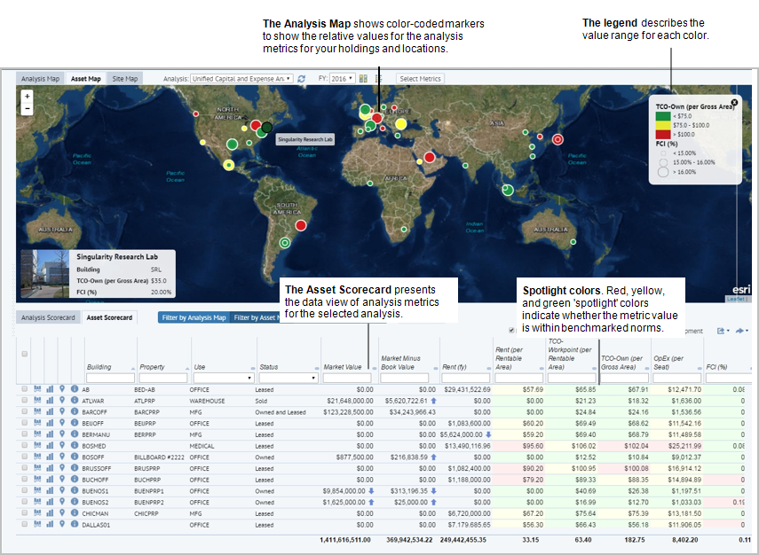
When you make selections in the Financial Analysis Console, the metrics refresh to reflect your selections:
- Select a category in the Capital and Expense Matrix to see just those metrics in the map and scorecard panels.
- Select the Filter by Analysis Map or Filter by Asset Map button, to adjust the Asset Scorecard to show metrics for just the assets shown in the map. For instance, if you zoom in with Filter by Asset Map button selected, the Asset Scorecard adjusts to show metrics for the area you have zoomed in to.
- To reverse the process, select Filter Asset Map by Scorecard to have the Asset Map show only the assets in the Asset Scorecard.
The Analysis Map and the Analysis Scorecard panels present more summary information for cases in which you wish to work with aggregated data, or present summary findings of your deeper analysis. These panels also react to your selection within the Capital and Expense Matrix, allowing you to quickly drill into costs and their allocation, or to drill into different aggregate metrics, such as total cost of ownership or occupancy.
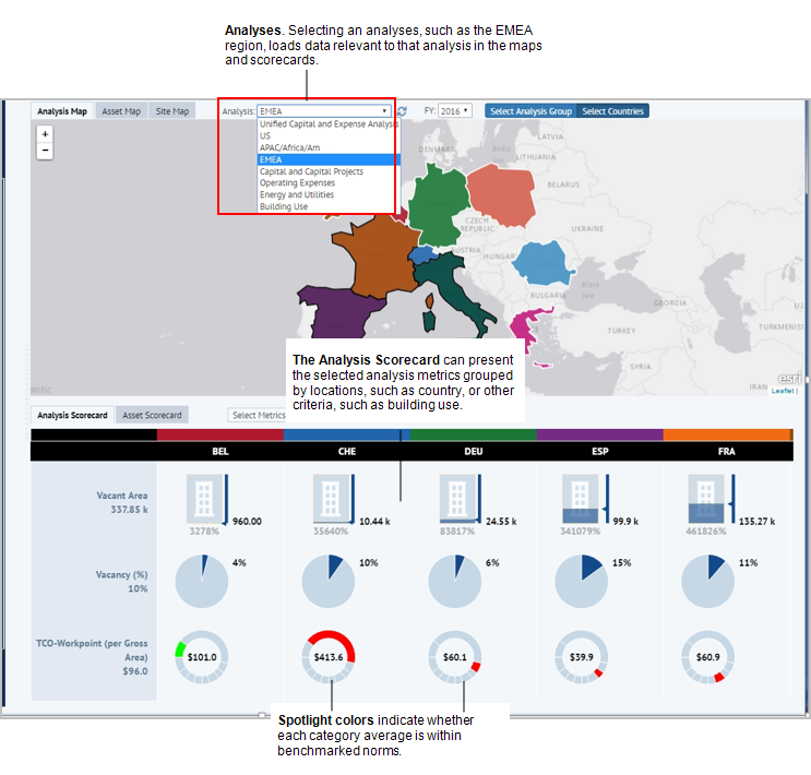
All panels react to selections you make from the drop-down Analysis selection. This drop-down list contain pre-defined analyses to which you can add your own.
See Define Financial Analyses and the Analysis Fields.
Different analyses can focus on different metrics – such as capital costs, operational expenses, building use and vacancy. Alternately, different analyses can focus on different geographical regions, divisions, or building use categories. 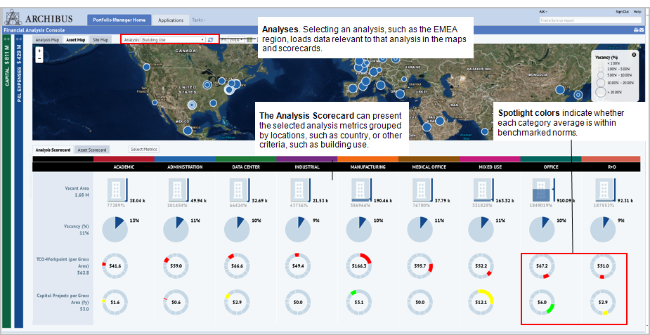
The Asset Scorecard panel automatically updates depending on selections you make in the map, enabling you to perform ad hoc analyses of specific regions.
For example, you can automatically filter the Asset Scorecard by the Analysis Map or by the Asset Map, depending on whether the Filter by Asset Map or Filter by Analysis Map button is selected. When working from the Analysis Map, if you also select the Select Countries button, when you click on a country in the map, the asset scorecard refreshes to show metrics for just that country. When you click on a second country, the metrics for that country and for the first country you clicked on are both displayed.
The following image shows the Asset Scorecard filtered by Spain, France, and Italy. By clicking on each of these countries in the map, you restrict the Asset Scorecard to show metrics for only these countries.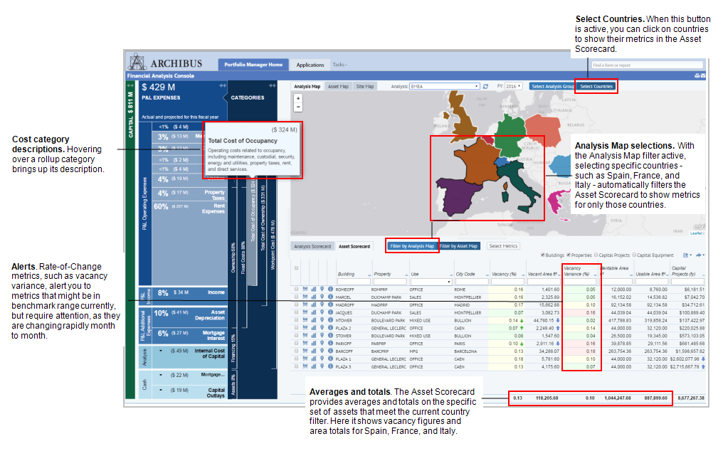
The Site Map panel displays the campus-level view of your buildings and their boundaries. As with other panels, the site map can highlight buildings with "stoplight" colors that indicate performance of a selected metric, such as total utility cost per gross sqft or sqM.
