Archibus Mobile Framework Fields
The Archibus Mobile Framework contains form field classes that extend the functionality to the Sencha Touch form fields. In most cases, the Archibus classes should be used in place of the Sencha Touch framework fields.
The below table offers a summary. Each field type is detailed below.
| Name | Class | xtype | Use |
|---|---|---|---|
| Document | Common.control.field.Document | documentfield | Display an image file with a title on a form |
| Number | Common.control.field.Number | formattednumberfield | Display a numeric value with localized formatting. |
| Prompt | Common.control.field.Prompt | prompt | Provide a way for the user to select a value from a large list of records. See also User Friendly Prompts. |
| Search | Common.control.field.Search | commonsearchfield | Use instead of the Sencha Ext.field.Search class. Applies styles to remove the Android field overlay. |
| Text | Common.control.field.Text | commontextfield | Use in place of the Sencha Ext.field.Text class. Applies styles to remove the Android field overlay. Sets common property values. |
| TextArea | Common.control.field.TextArea | commontextareafield | Use in place of the Sencha Ext.field.TextArea class. Use for multi line text input. |
| TextPrompt | Common.control.field.TextPrompt | textpromptfield | TextArea field with a pop up list of items |
| TimePicker | Common.control.field.TimePicker | timepickerfield | Use to display a time selection popup. |
Document field
The Document field is used to display an image with a title. The Document field provides an easy way to display an image that is captured by the device camera.
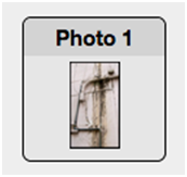
Class name: Common.control.field.Document
xtype: documentfield
Using the Common.control.field.Document field
Ext.define('Common.form.FormPanel' , { config: { items: [ { xtype: documentfield', name: 'doc1_contents' label: 'Photo 1' } ] } });
Number field
The Number field creates an input field that accepts numeric input. The Number field applies the localized numeric format to the input. The Number field can be configured to display currency, area, and length units in the label field.
Note: The Number field is used in Archibus mobile apps in place of the Sencha Ext.field.Number because the Ext.field.Number input does not support localization on most mobile browsers.
The below image shows the Number field with the labelFormat property set to currency.

Class name: Common.control.field.Number
xtype: formattednumberfield
Using the number field in a form panel
Ext.create('Ext.form.Panel', {
fullscreen: true,
items: [
{
xtype: 'fieldset',
items: [
{
xtype: 'formattednumberfield',
label: 'Actual Cost',
name: 'cost_total'
}
]
}
]
});
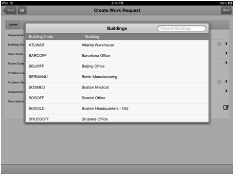
Prompt field
The Prompt field provides a selection input control similar to the Web Central Select Values field. The Prompt field should be used when the user is required to select an item from a large number of records. The Prompt control displays a list of items when the field is tapped. The Prompt field value is set to the item that was selected in the list. See also User Friendly Prompts.
Class name: Common.control.field.Prompt
xtype: prompt
Using the prompt field in a form panel
Ext.create('Ext.form.Panel', {
fullscreen: true,
items: [
{
xtype: 'fieldset',
items: [
{ xtype: 'prompt',
title: 'Employee',
label: 'Employee Code',
store: 'employeesStore',
displayFields: [
{
name: 'em_id',
title: 'Employee Code',
},
{
name: 'email',
title: 'Email',
}
],
}
]
}
]
});
Search field
The Search field should be used in place of the Ext.field.Search class. The Common.control.field.Search class removes the Android field selection overlay from the displayed search field.
Class name: Common.control.field.Search
xtype: commonsearchfield
The below image shows the Search field displayed in a title bar.

Using the search field in a title bar
Ext.define('Common.form.FormPanel', {
config: {
xtype: 'titlebar',
itemId: 'myWorkToolbar',
items: [
{
xtype: 'commonsearchfield',
align: 'left',
name: 'workRequestSearch',
placeHolder: 'Search'
}
]
}
});
Text Field
The Common.control.field.Text class can be used in place of the Ext.field.Text class. The Common.control.field.Text class creates a text input that disables the auto complete property of the field. The class also disables the Android field overlay selection.
Class name: Common.control.field.Text
xtype: commontextfield
Using the text field in a form
Ext.create('Ext.form.Panel', {
fullscreen: true,
items: [
{
xtype: 'fieldset',
items: [
{
xtype: 'commontextfield',
name: 'requestor',
label: 'Requested By'
}
]
}
]
});
TextArea field
The TextArea field provides an input for multiple lines of text. The TextArea field can be configured to display a full screen input box when the field is tapped. The full screen input mode is useful if a large amount of data has to be edited.
Class name: Common.control.field.TextArea
xtype: commontextareafield
Using the TextArea field in a form panel
Ext.create('Ext.form.Panel', {
fullscreen: true,
items: [
{
xtype: 'fieldset',
items: [
{ xtype: 'commontextareafield',
name: 'non_em_info'
}
]
}
]
});
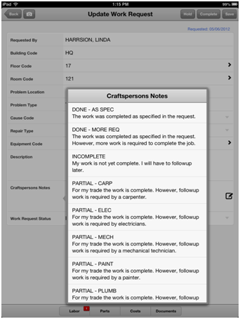
TextPrompt field
The TextPrompt field is a TextArea field that provides a popup selection list to be displayed. The TextPrompt field value is set to the selected item in the popup. The TextPrompt field also accepts input in the field without using the popup selection.
The below image shows the TextPrompt field displayed on the Ipad.
Class name: Common.control.field.TextPrompt
xtype: textpromptfield
TimePicker field
The TimePicker field provides a pick list to select hour and minute values.

Class name: Common.control.field.TimePicker
xtype: timepickerfield
Using the TimePicker field in a form panel
Ext.create('Ext.form.Panel', {
fullscreen: true,
items: [
{
xtype: 'fieldset',
items: [
{ xtype: 'timepickerfield',
label: 'Time Started',
name: 'time_start',
value: new Date()
}
]
}
]
});