System / Add-in Manager / View Definition Wizard
Defining Chart Options for View Analysis-Style Views
If your view has a chart, the Set Options tab displays additional options for specifying the properties of the chart.
The Grouping Axis and Data Axis (X Axis and Y Axis)
As discussed in Defining View Analysis-Style views, you must specify a grouping field. Charts use the grouping fields as follows:
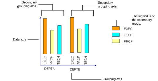
- If you choose one grouping field, the chart uses the grouping field to form the values on the x-axis (known as the grouping axis). The chart shows the calculated field values on the y-axis (the data axis).
- If a chart is grouped by two fields, it uses the first grouping field as the x-axis and the second grouping field forms the cluster of bars in the chart. The chart shows the calculated field values on the y-axis (the data axis).

Options
- Chart Type -- Indicates the type of chart, such as a bar chart, pie chart, stacked bar chart, and so forth. For examples of the types of charts, see Chart Examples.
- Show Axis Labels? -- Select Yes or No depending on if you want the system to label the axes of the chart. Labeling the axes typically results in a clearer chart.
- Width/Height -- Determine the size of the chart as a percentage of the size of the panel in which the chart displays. Typically, 100 percent works well and provides a sufficient white space border. However, if you wanted the chart to occupy 90 percent of the panel, which results in a panel with a larger border of white space, you could enter "90" for these values.
- Show Legend -- Set this option to Yes if you want the chart to display an example of each of the colors it uses and label each these colors with what the color represents.
- Show Data Tips? -- If you want the user to be able to mouse over an element of the chart to receive the exact data that the chart represents, set this option to Yes. Data tips provide the calculation formula that the view executes, the grouping field, and the calculated data.
- For example, if you have a column chart that presents total building area by state and the chart's labels are in increments of 1000, the user can examine how close a column it is to the nearest 1000 increment to obtain an estimate of the building area. If users want to obtain the exact building area that the column represents, they can mouse over the column to access the data tips with the exact building area.
- Background Color -- Displays an alpha-numeric value (the hex or RGB value) representing the background color against which the chart is set. For a list of possible colors and their values, see the HTML Colors discussion on www.w3schools.com.
- Fill Type -- Determines the fill for the elements of the chart. Choose from Solid, Linear Gradient, or Radial Gradient. The system will start with the color you specify in Fill Color; for charts with more than one grouping field, the system will start from default colors.
- A linear gradient specifies a gradual color transition in the fill color that starts at the boundary of the chart element.
- A radial gradient specifies a gradual color transition in the fill color that radiates out from the center of the chart element.
- Fill Color -- Displays an alpha-numeric value (the hex or RGB value) representing the color of a single series column or bar chart. For a list of possible colors and their values, see the HTML Colors discussion on www.w3schools.com. For charts with more than one series, the program uses default colors.
- Percent Gradient Change -- If you chose Linear Gradient or Radial Gradient as the Fill Type, you need to set this option to specify the ratio by which to change the color. Valid values range from 0.0 to 1.0.
- Percent Transparency -- If you chose Linear Gradient or Radial Gradient as the Fill Type, you need to set this option to specify the ratio by which to make the color transparent. The valid values for the are 0.0 (invisible) through 1.0 (opaque).
Note: If Percent Gradient Change and Percent Transparency are not specified for a Fill Type of Linear Gradient or Radial Gradient, the chart uses a default setting.
- Label Position (Data Axis) -- Use this option to add data labels and set the position of the labels. For pie charts, you can choose from all options. For bar charts and column charts, the callout options are not available.
- None
- Outside
- Inside
- Callout
- Inside with callout
- Label Rotation (Data Axis) -- Enter the angle at which to rotate the label, if any.
- Auto-Calculate Tick Size Interval -- Set to Yes to have the system automatically set the intervals for the data axis based on the values that the chart displays. If you would like to set your own increments, set this option to No and complete the below option.
- Tick Size Interval -- Defines the increment size of the labels on the data axis. For example, if the value is 500, the data axis label will show: 0, 500, 1000, 1500, and so on.
- Enable Drilldown? -- Check this option if you wish the user to be able to click on the chart to drill down to detailed information. For example, if you create a column chart that summarizes area by postal code, the user can double click on the column to invoke a pop-up displaying the records that contribute to this total.