Archibus SaaS / Maintenance / Reports
Maintenance / Corrective Maintenance / Management Reports
Maintenance / Corrective Maintenance / Operational Reports
Maintenance / Preventive Maintenance / Management Reports
Maintenance / Preventive Maintenance / Operational Reports
Maintenance Report Builder
Many organizations have “super users” who require access to all work requests, open or closed, regardless of the supervisors and work teams to which those requests are assigned. These users need a comprehensive list of all work and need to report on this work in a variety of ways.
The Maintenance Report Builder (ab-bldgops-report-console.axvw) is a central console from which you can access all work requests and specify which data you want to report on (such as problem type by criticality), set a robust filter to specify the records included in the report, and generate bar charts, pie charts, and alphanumeric reports for the specified data .Once you generate the report, you can export it and print it and drill down into the individual work requests.
Access the Maintenance Report Builder Console from:
- Maintenance / Corrective Maintenance / Operations Reports
- Maintenance / Corrective Maintenance / Management Reports
- Maintenance / Preventive Maintenance / Operational Reports
- Maintenance / Preventive Maintenance / Management Reports
You can create multiple reports and toggle between them. The Console displays each in its own tab.
Set the Basic Report Criteria
Using the panel at the top of the view, you can select options to generate a variety of reports on all types of data. The Report Console generates a title for your report using the items that you specify . For example, in the following image, the report title -- All Work Total Cost Group By Craftsperson -- summarizes the data that the user has selected for the X and Y axises. The tab provides an abbreviated name.
Notice that the red text below the report title provides additional information about the data contributing to the report; in this case, the default time period, the current calendar year.
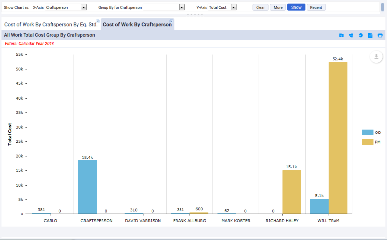
Depending on the data on which you are reporting, the Console may automatically group the data by a category, such as Work Type (Corrective Maintenance or Preventive Maintenance) as shown above. When reporting on other data and you do not specify a grouping option, the report might break down the data by Schedule Status (On Time or Overdue) or Work Status (Open or Completed). You can use the More button to access the options that control this. For example, for the above image, you might want to set the Work Type option to just Corrective Maintenance.
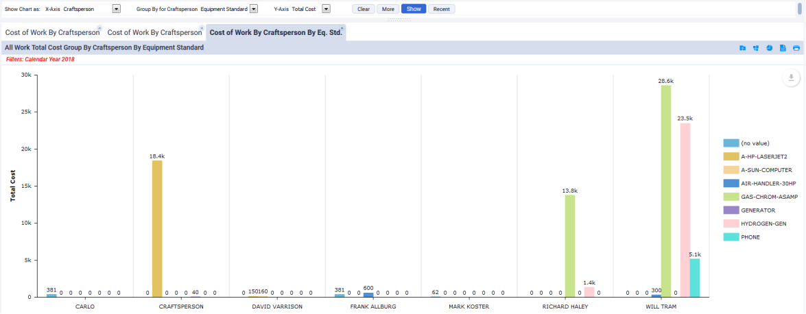
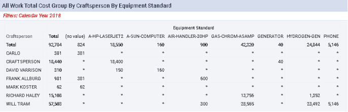
In addition to having the report automatically group the data, you can group the data by selections you make. The Group By option splits the X-Axis data into subgroups (secondary groupings). For example, in the below image, the cost of each craftsperson is grouped according to the equipment standard associated with the work. Note that setting a Group By option may cancel a grouping that the report previously used before you specified one. For example, in the below image, the report does not distinguish between Corrective Maintenance and Preventive Maintenance as it did before adding a Group By option.
Filter the Report Data
To restrict the report to a key set of data, use the More button to show additional options by which you can report. For example, in the below image the user has restricted the "Cost of Work by Craftsperson by Equipment Standard" report to focus on data from a particular calendar year and work by a particular trade (ELECTRICIAN-II). The items that you select from this panel will be listed in red beneath the report title so that you have a clear reminder of the data that the report is showing. Use as many filter options as desired to limit your report to the specific data on which you want to focus.
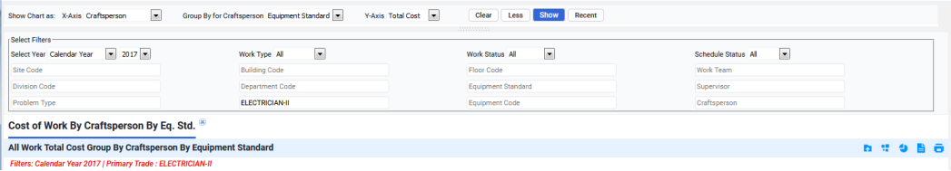
Note: The time frame for the fiscal year is determined by the Fiscal Year Start Month and Fiscal Year Start Day values in the Archibus Schema Preferences table (fiscalyear_startmonth and fiscalyear_startday values in afm_scmpref table).
Once you set the X and Y axes and optionally a grouping option or filter, the Console generates a bar chart, as shown above. From here you can access the data in different formats, as discussed in the following sections. No matter the method by which you display the data, the Console will include the restriction in red text as a reminder of the filter you have set.
View the Data in a Report
Use the Summary Report button in the icon menu (located in the upper right corner) to display the data in a summary report.
![]()
Once you choose the Summary Report button, the button toggles to a bar chart button so that you can return to bar chart format.
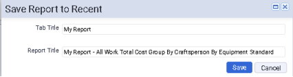
Save the Report or Bar Chart
When the data is displayed as a report or as a bar chart, you can save the report for future access using the left-most button. If you have taken time to set restrictions and other properties of a report, you will find this option handy for saving the report so you do not need to re-create it..
Use the leftmost button to access a form for entering a Tab name and Report Title for the current report or bar chart.
![]()
The Console will display the report in the tab you specify and the Recent button (located at the top of the Console will include this report.
View the Contributing Data
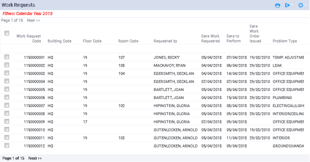
To see the specific data leading to the report or chart summary, use the Show Details button to access the list of work requests that contributes to the bar chart and report summaries.
![]()
From here, you can export the records and change the displayed work request fields using the icons in the upper right corner of the Work Requests form. Note that the list of work requests is filtered according to the filter you set, and the text at the top of the form reminds you of the filter.
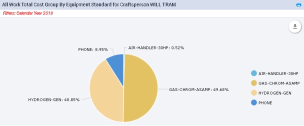
View the Data in a Pie Chart
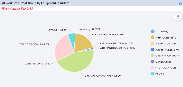
Use the Pie Chart button in the menu bar to display the data in a pie chart.
![]()
Since a pie chart can display only two pieces of data, the pie chart presents the sum of the category's Work Requests by the grouping. In the example of this section, the chart sums the cost of all work requests of all craftspersons and organizes by the grouping category, Equipment Standard.
You can also present the data of a particular category in a pie chart. Click a category on the x-axis -- for example, the bar for craftsperson Will Tram -- and the Console displays Tram's data organized by grouping category in a pie chart in a pop-up window. Mouse over each section of the pie to see the cost amount.