System / Add-in Manager / View Definition Wizard
Chart Examples
When creating a summary view that presents a chart, you can choose to create the following types of charts:
Pie Chart
A pie chart summarizes data in a circular pie, with each wedge of the pie representing the field on which you group the data. For example, the following pie chart illustrates total property acreage for each postal code; for each postal code, the view totals the value of the Land Acreage field of the Properties table. The legend informs you of the postal code that each pie wedge represents.
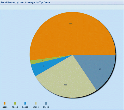
A pie chart can display only one calculation. If you specify multiple calculations, the pie chart displays the first calculation it encounters. Similarly, it supports only one grouping field.
Column Chart
A column chart presents each calculation in its own column. For example, here is the total property acreage by postal code data in a column chart, with each postal code listed on the horizontal axis. Here, the legend informs you of the calculation (sum of the values of the Land Acres field) that the chart is running.
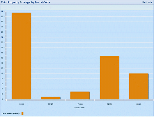
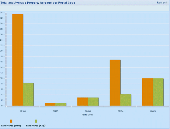
Whereas a pie chart can display only one calculation, a column chart can display multiple calculations. For example, the following chart includes average and total property acreage per postal code, and the legend defines the calculations.
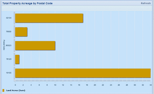
Bar Chart
A bar chart is similar to a column chart except that the bar chart displays data horizontally, rather than vertically. Bar charts are handy for charts that have lengthy labels, since the labels can display horizontally and can be easier to read.
Here is the same property acreage by postal code data presented as a bar chart, with each postal code on the vertical axis.
Stacked Bar Chart
When you have multiple grouping fields, it is handy to show the data in a stacked bar chart, which places grouping fields vertically on one another, in distinct colors, to create one bar stack. If there is only one grouping field in your chart, the stacked bar chart will display the same as a bar chart.
Line Chart
A line chart displays the calculation as a set of points connected by a single line. Line charts are handy for presenting information over a continuous period of time. For example, Total Lease Negotiable Area By Year can be presented in a line chart.
Stacked Area Chart
A stacked area chart is similar to a line chart but fills in the area below each line. Stacked area charts show the proportion that each item contributes to the total.
Column Line Chart
A column line chart is a combination chart that combines a column chart and a line graph. The column-line combination is an effective way of contrasting one data series against another.