Archibus Smart Client
Create Analysis Views
View Analysis views (also referred to as summary views) provide summary statistical data and charts for the current view.
While you can create View Analysis views in Web Central, you may wish to do so in Smart Client as well.
- If you check the same statistics weekly or monthly, you can create the view and then reload it from Favorites and get exactly the repeatable information you want.
- Add-in managers who want to create datasources for analysis views and chart views (even if they use these view fragments as the basis for more complex Web Central views) can preview the data and the statistics in Smart Client before they create the view or view fragment
You generate your views using the View / Analysis command .

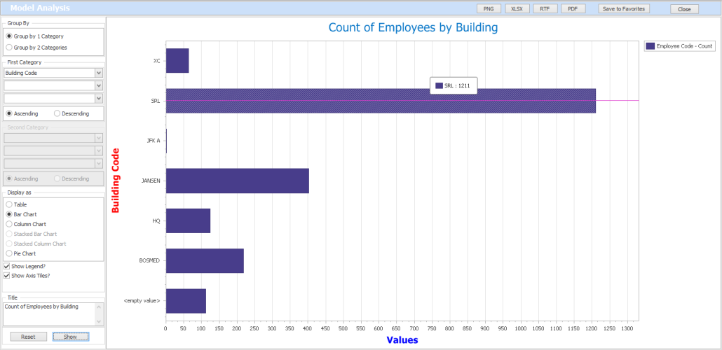
The Analysis command presents an editor in which you specify properties of the analysis view and then the editor displays your view. For example, the below image illustrates starting a new view by loading the Employees table and then using the options in the left panel to define a simple analysis view that counts the employees in each building and displays the result in a bar chart. You can specify a title, choose to display axis labels, and choose a legend (Employee Code - Count in below image). Notice in the following image that if you hover over a bar, the view displays the exact value that the bar represents.

In this case, the Employees view did not have a numeric field on which the view could sum; therefore, the Analysis command presented a count statistic. Before running the Analysis command, use Select Fields to activate the integer or numeric fields you want the Analysis view to calculate.
You can experiment with the different display options (table, bar chart, column chart, pie chart) to display the data.
Note: If your project contains a lot of records or the view has a lot of numeric fields, the system might have trouble displaying the chart and will display a message. In this case, you may want to first restrict your records to a smaller set of data or remove some of the numeric fields from the view. You can then regenerate report.
Grouping Fields
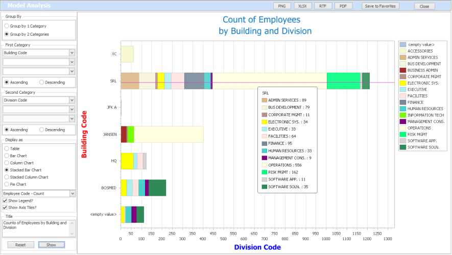
In the above image, the user chose to group by one category: Building Code. Choosing the Second Category option and adding Division enables you to count the number of employees in each division within each building, as per below image. When you add a Second Category option, you can additionally create Stacked Bar Charts and Stacked Column Charts.
In this case, the bar for each building is proportionately colored according to the employee counts of the divisions within the building. The legend on the right maps the colors to divisions, and you can hover over a bar to see the count values for each division within a building.

When specifying the First Category an Second Category fields, you can specify more than one field for each option. This is handy for multi-part keys and hierarchical values, such as a Building-Floor or Division-Department relationship. However, you can specify any value and the analysis view will combine these values, such as Building-Employee Standard, as shown below.

Note: The grouping fields overwrite the view's existing sort order.
Calculations
Counts
If the view currently displays no numeric or integer fields, the system counts the number of records for each grouping category.
Whenever you choose a Table view, the view always includes a count as well as the summary statistics.
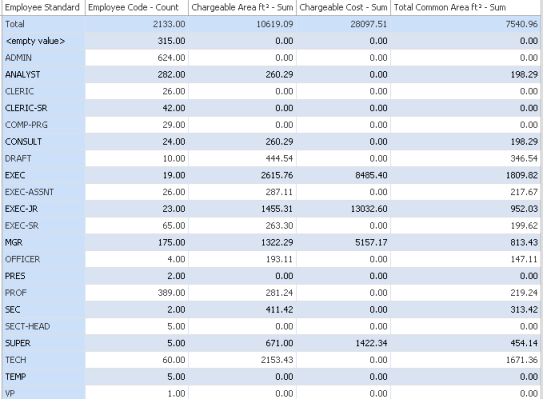
For example, the below view on the Employees table grouped by Employee Standard, counts the number of employees assigned to each standard and sums the area fields by employee standard

To create this view, you would follow these steps:
- Open a table view of the Employees (em) table.
- Use the Select Fields command to make the following fields visible: em.area_chargable, em.cost, and em.area_comm.
- Select the View/Analysis command from the ribbon.
- In the Analysis form, select Group by 1 Category; set First Category to "Employee Standard."
- Retain all other defaults and select the "Show" button.
Sums
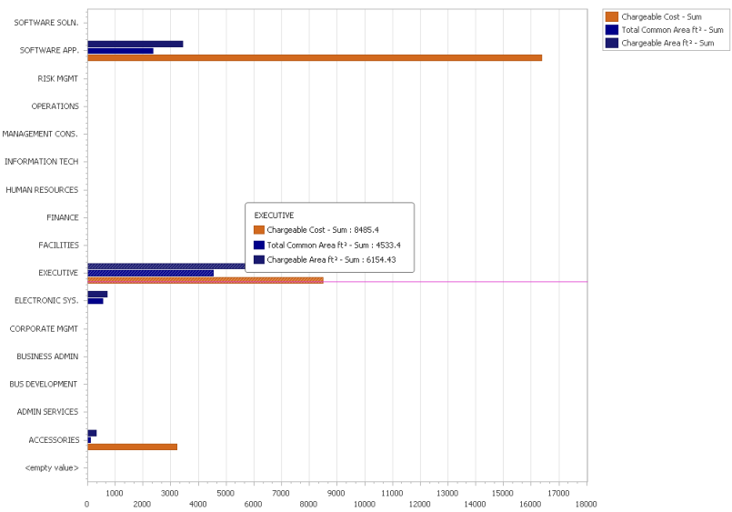
For every numeric and integer field of the current view, the command sums the value for the category fields. The charts display one bar or column for each summary calculation and include these colors in the legend.
Use the Fields command to control the active numeric and integer fields in the view.
For example, there are three numeric fields active in the below view of the Employees table, so the system generated three bar charts for divisions that tracked these three fields.

Procedure
- Start a new view and add a table to it. Or, load an existing view from the Navigator.
- Use the Fields command to display in the view:
- the numeric and integer fields you want to sum. If you choose to display no numeric or integer fields, the command will create a count of the records by your grouping criteria.
- the fields you want to group by.
- Optional: Set a restriction. If you have a lot of values for your grouping fields, the chart may not have enough room to display all the grouping fields as labels. First restricting the data to a more focused set may enable you to display all the labels.
- Select the View / Analysis command and use the options on the left of the form to define your view. You will set:
- One or two grouping categories
- Format of the view (table, pie chart, column chart, bar chart). If you are working with two categories, you can develop a stacked bar chart or column chart.
- Legends, title, and axis title.
- The system displays your table or chart in the editor. If you have specified to generate a chart, you can hover over the various columns and bars to see the exact values represented by the bar or column.
- Once you are satisfied with your view, save it to your Favorites. You can also export it to various formats using the options at the top of the editor.